Friday, May 31, 2019

Finding Inspiration Part 3 by Alex

Hello Lovely Flair Enthusiasts!

Alex here with the next installment of my Lost Mojo (or Finding Inspiration) series!  If you missed the first installments, you can find them here:
Part 1
Part 2

So what are we going to discuss today? I honestly didn't expect this to become quite the epic it has, but I'm hoping you're enjoying it (or at least the lovely flair on my layouts πŸ˜‰)

This is the bit when I think it's worth talking a bit about finding inspiration from OTHER PEOPLE.  I guess you'd say it's like pulling out the big guns if you're really stuck, or perhaps you always do this and there's nothing wrong with that.  There is one golden rule as far as I'm concerned, though and that it to always acknowledge your source or inspiration

There are various ways you can be inspired by other crafters - using a sketch created by someone else, "scraplifting" a finished layout or perhaps taking a class offered by another crafter.  I regularly use all three methods.

Sometimes, my chronic illness doesn't allow me to do the entire process so through trial and error I found that when I need to buy some time or energy, taking this first step out of the equation for me is key to having a finished layout and story told.

Today we'll have a look at scraplifting.  What's "scraplifting" I hear you ask?  While I dislike the term (it implies stealing), it's effectively copying someone else's project.  We're taught that's a big NoNo at school, but that's why people share their work online.  When you find a layout by another scrapbooker that you'd like to reproduce, or get inspiration from, there are endless degrees to which you can do this.

The layout I'm scraplifting is by Shimelle Laine.  Her "style" is pretty close to mine so I often am inspired by her work.  The layout I'm "scraplifting" is a few years old and can be found HERE.  I really recommend you have a look at it first.

Now I could reproduce this layout exactly if I wanted to since I have all the exact same supplies in my stash (I know! 🀦).  I've never done this though!  Not that her layout isn't perfect as it is, but I personally don't want mine to be a cookie cutter replica.  Where's the creativity?  Talking about creativity may seem like a luxury when your mojo is MIA, but I promise, once you get going you will see that your page starts to develop a mind of its own even if it's a pretty close scraplift.

I'd call mine pretty close.  I guess for me it is since I know how far (or not) I end up when I do this.  There are loads of examples on my blog.  If you click on the word "scraplifting" at the bottom of a post on my blog when I use it (like this one), it will bring up more entries.

You might deviate a lot more (and I have a layout in progress where my scraplift took on a mind of it's own which I will post when I revisit this topic later) or a lot less.  Both are absolutely OK!

So where to start?  The easiest way to stay true to the original is to choose a photo which is roughly the same size and orientation.  In this case it appears to be 4x6 in landscape.  Mine is a touch smaller.  The next thing is to pick supplies, but I do find that when scraplifting, the layout does tend to evolve so it's never quite that simple.

My process for this exercise was to first decide on my background paper.  I did toy with navy, but if I was going to use the black and white "Cats" flair badges I'd have to include at least some black which can be a challenge with navy, though not impossible.  I ended up choosing a dark grey which bridged the gap between black and the colour of the grey cat.  I also wanted the focus to be more on the colours of the box. 


If you read Shimelle's blog post and journaling, you'll see that rainbow and colour overall play a key aspect in her story, whereas in mine, the story is about the box in the photo, so emphasizing those specific colours made sense, but I did want to include somewhat of an array of bright colour (especially red of the box (and to a lesser extent blue)). 


Since my photo had far fewer colours than Shimelle's, and that initial pop of rainbow is what makes the dark background so striking, I did want to include some multicoloured paper with black (OK so it could be a very very dark navy in the triangle pattern but reads as black) as well as incorporating all the other colours I planned to use. 

I also ended up having to use more layers because it just didn't look "right" with fewer. 

 
This is what I mean when I say the layout starts taking on a life of its own!  I had to go back and search for various colours and add them in a few times! 

As you can tell, I deliberately curled up loose corners for texture!

I was also thinking embellishment at the same time.  I did want to use that same "delighted" die cut since it's a word frequently used in Regency society and had all the colours I was going to use! 

I wanted to use stitching like Shimelle, although mine was more for decorative purposes (except in a couple of places) rather than holding down notorious chipboard!  I like leaving loose threads if it suits the layout and anything to do with cats suits since they like string and yarn.


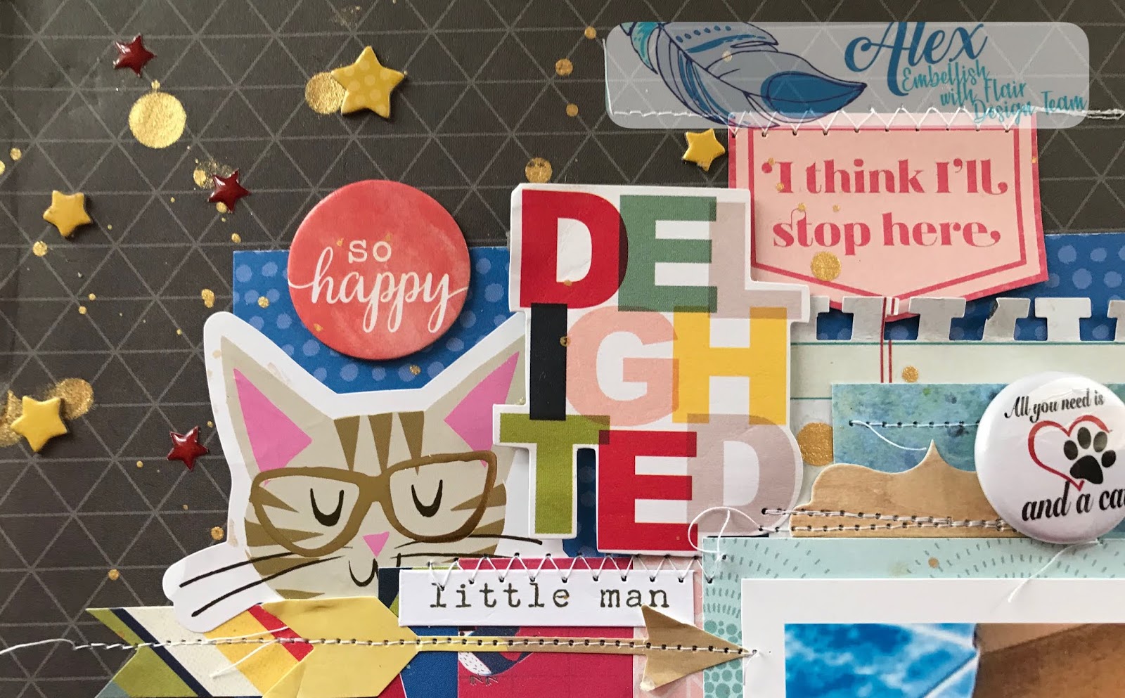
I wanted to use some gold also as a nod to the Regency era, so gold mist and gold detail on some of the embellishments worked with the Thickers.  Also...if you're going to stitch, make sure said mist is totally dry or else you'll have to cover up the smudges with the chipboard and enamel stars!! 🀦🀦🀦

I positioned the badges around the photo and picked mostly white ones to stand out.  I did have to use the one with a touch of red to again go back to the original chicken box element of the story!  Also, my son calls him "little man" so that sticker on the top left was perfect in all aspects. 

I'm sure you can figure out the connection between cats and birds/feathers.  It's one of the few times I use bird paper since I have a phobia and aversion to the things and quite frankly the connection freaks me out further, but 🀷.  Shimelle jokes that I'm the only one allowed to disike the birds she has included in her last few collections! 😳😳😳

Most people wont have any idea that all these little decisions relate to the story and my memory of the event, but I love all these little connections and they really make the memory complete in my mind.

Speaking of story...that cat is named Fitzwilliam (after the heartthrob hero), and there is also a character in the novel called Colonel Fitzwilliam!  Not who he was named after, but a good pun in light of the story being about the box!


So can you see how while I have scraplifted a layout, I've also used elements from the Part 1 and Part 2 of this series as well to help make the layout my own and just let the initial inspiration take me where it was going to lead. 

Colonel Fitzwilliam


Well thanks for sticking with me and hope to bring you another way to find that lost mojo very soon!

Embellish With Flair products used: Cats set


Love, and Embellish With Flair!

--Alex xx


Tuesday, May 28, 2019

Not Fair by Suzanne Franin


Hey Everyone Suzanne here

This project for Embellish With Flair was inspired by the photo

This little one was not happy her sister was going to Kinder and she wasn't 
Such a sad little face, it breaks my heart

I used the Watercolour Flowers Flair set I love how they worked so well with the papers embellishments and I chose from the Happiness Range from Cocoa Vanilla Studio


With the tassle and tab I attached to a card so that her mum can write the story on it so they will always have the memory of that sad face

Embelish With Flair products I used

Watercolour Flowers

Thank you for visiting I hope you come back soon x

Tuesday, May 21, 2019

Finding Inspiration Part 2 by Alex

Hello Lovely Flair Enthusiasts!

Alex here with the next installment of my Lost Mojo (or Finding Inspiration) series!  If you missed part 1 you can find it here.

Today we're talking colour.  I absolutely love colour and don't shy away from throwing lots and lots of it on my layouts!  So how can we use colour to get us out of a creative rut?

Are you a crafter who needs to start with a basic staple like white cardstock each time or do you prefer colour and or pattern? 

You can still be inspired by colour even if you are, for example, a white-sheet-of-cardstock-as-a-base scrapbooker.  You just need to keep this in mind while you pick out your other supplies in your chosen colour scheme

There are plenty of colour palettes all over the internet like Pinterest (we’ll touch on Pinterest a bit later) where someone else has come up with a selection of colours (usually to go along with an inspirational image.

You may wish to take colours from your photo, but you don’t have to.  It may seem like a strange idea, but it can work really well especially when the colours in your photo don’t relate to the story as it happened in your head or reflect how the event really was.  (Today’s layout is one of these!).  For example, a photo taken on an overcast wedding day (especially of its of guests rather than the bride and groom) wouldn’t be true to the story if created with similar colours!

So where to begin if you want to use colour to get your mojo going again?  Are there any specific colours that relate to your story or memory?  Today’s layout is one of many layouts of my son’s year 6 graduation.  I use his school colours throughout his “school” album: purple, aqua/turquoise and black.  I also use a fair bit of grey since it's one of my favourite neutrals and the boys’ school uniform has a lot of grey.  This doesn’t mean each page in that album uses those colours and only those colours.  Usually it incorporates one or more colours mixed with others to make new combinations while still giving a sense of continuity.

Doing a Google search for color scheme or colour palette (followed by the name of at least one colour) can give you sites like Magnet Street or Design Seeds for example. With colour palettes created by other people,  I prefer to search Pinterest and make boards for various albums where I have recurring colours. 

There are also sites like Coolors where there are random colour schemes constantly generated,  you can enter a colour to filter the colour schemes in the database,  adjust shades and hues,  pick colour schemes based on a photo and so much more!

I find that searching Google or Pinterest for one colour at a time gives better result than entering the whole string, but definitely try both and in between options.

So…for today’s example I did just that, but not at the very start of my process.  Firstly I got an idea when I saw these Embellish With Flair purple star badges.  I use stars as a motif in the school album, but even more so in the graduation photos.  For some reason I thought of cut files with a star in place of a letter like this super star cut file by Paige Evans.  I don’t use cut files on all my layouts, but it fit beautifully in one of his graduation layouts.  Especially when the star is turned into a shaker!! 

I decided to look through some of Paige's collections as a starting point.
πŸ“Tip when you get stuck: if you’ve made one decision, stay with the same manufacturer or designer as a starting point.

I got really excited when I saw paper 11 from Turn the Page collection.  Then I saw paper 19 and decided I was found to fussy cut both papers.  The back of this paper co-ordinated beautifully and I toyed with using it as a background, but I wanted my cut file and stars to stand out and the stripes might compete too much with everything else, but I hadn’t ruled it out.

In any case, the fussy cut stars in the “wrong” colours could be turned around and used anyway!  I did want more than just the aquas, greyish blues and greens.  I hoped to add purple and possibly something else.


I searched Pinterest for the terms colour palette and colour scheme with each of the colours and saved anything that grabbed my attention.  I really wanted to see how purple would look with these colours in an actual example to confirm how it linked up in my head.  Lots of times I imagine something and it simply doesn’t translate to paper the way I thought.

Most of the search results that come up on Pinterest are from Design Seeds.  You can visit their website directly and what I love most is that there is an image along with the colours they chose, so you can use the image and add more options for yourself.

 What I love about Pinterest is that you can make a board (even a secret one if you don’t anyone else to see it) and save what grabs your attention.  Like this cat.

It more or less had the colours I was after.  Another one of Paige’s collections has a very pale purple, but I wanted something a bit bolder so I kept looking and found these other palettes.


I figured that between the three I was set.  I was a bit disappointed not to find a new colour, but when I thought about all the shades of the ones I had, I probably had enough.  The exact greens in some of the palettes are way off, but it gives the general idea.  A more muted green needs a more muted purple, but in the case of this…the lime green goes really well with the bright purple.

So back to my layout.  I use a nested star cut file of Paige’s and cut different sized starts on the silhouette out of mostly purples, but a few more greens and aquas to.  I tried to pick papers where I could use both sides.

I cut my title and printed my photos then took a punch or two to the scraps to get some tiny and medium stars.


Shaker Pocket and backing the cut file - done!

Stitching some of the stars together for texture and interest - done


Once everything was in position, I used a ruler to mark out the area for the starburst and stuck down the stars.

I used the flair badges to make the centres of the letters such as R and P since they didn’t have them and the stars on the flair badges co-ordinated with the shaker pocket star A.  It's a lot of flair in a concentrated area, but they definitely stand out!

As much as I love piling on the embellishment, this page didn’t need a whole lot.  I used a little bit (for me), but even so, the whole page is practically covered which is NOT what I had in mind!  The title isn't the best choice for the specifics of the story.  On the surface it's about that bear, but on a deeper level it's about our relationship and I always think of him as my buddy and my superstar so while other stories of the night might have been better suited to this title, it's certainly not totally out of place.


Mama's Super Star


Embellish With Flair Product used: 3 Tone Stars Purples


That's all from me for this installment.  I hope it made sense.  Colour is such a vast topic!  If you have any questions, comment below! 

Love and Embellish With Flair,

-Alex xx

Wednesday, May 15, 2019

Bold & Beautiful with Heather


Hi. So excited to share my first project for Embellish With Flair.
I have fallen in love with this paper range. I have done lots of fussy cutting and lots of layers


https://www.embellishwithflair.com/store/moments

The flairs were perfect to help journal my memory from The Grand Canyon.


Sunday, May 12, 2019

Steampunk Wreath by Suzanne Franin


Hey Everyone Suzanne here

Here is my first project for Embellish With Flair

Also make sure to check out the rest of the BLOG to see what our team have come up with for inpsiration

I love Steampunk so it was perfect that I got the Steampunk Flairs 


It's sitting a bit lopsided as the flowers under the owl are a bit heavy and I couldn't get it to sit right 
I started with a polysterene ring then wrapped some sheer material around it 
After that I used my glue gun to add some extra texture because I knew I wanted to add some wax later for some more colour
I then painted it with a mix of a rust paint and brown paint for that steampunk vintage look

I used some plastic wings which I painted with clear gesso first so the wax would adhere to them then add the clock faces flair to the centre 
Under them I used a paper clay clock which was also painted with was 

With this flair it had cogs and bits so I added metal around it and a clock with a nice red rose to offset all the browns
This is the third flair in the set and again I added a rose and some more metal - Steampunk is all about metal and findings I think that's why I like it so much
Here you can see some of the metal and a close up of the paper clay clock I used I added a light rub of gold wax to the top of everything once I was finished glueing everything down
Another obsession is owls and you'll see quite a few on my projects this one is made of paperclay and the flower piece underneath is made of plaster which I found along the way and it went perfect with this project 
I added some twine under the owl for some added detail
To finish the whole project I went around with some Gold glass glitter by Finnabair mixed with some Helmar Super-Tac Glue and placed it randomly for some sparkle and extra texture


Thank you for visiting I hope you come back soon x

Wednesday, May 8, 2019

Water Coloured Flower Flairs


Hello! Trace here , I’m so excited to be apart of this

Amazing Team for these

AMAZING Products

Embellish with Flair


Today  I would Like to share with you a layout I did called

“Memories”


I used Cocoa Vanilla Studio Papers “ Happiness” Range
along with
49 & Market – Burlap Trim
TSE Designs embellishments
Fringed Ribbon
Seabeads
& Water Coloured Flower Flairs


a set of 3 beautiful flairs are available in store for just $3.00
Hope I can inspire you

Thanks for popping by

Love  Trace xx 

Tuesday, May 7, 2019

Finding Inspiration Part 1 by Alex

Hello lovely Flair Enthusiasts!

Alex here with the very first Design Team project and blog post.  I love that the four of us have different strengths and passions and we all bring something different to the table.


Today I thought I’d talk a bit about inspiration or “mojo” (in particular lack of it!) as it’s known around the crafty community.  We’ve all heard about it and probably all experienced it…but how do we get past it if we want to make something?

Inspiration for a project can start anywhere no matter what you’re making.  It also can come from several areas at once.  Understanding the possible sources and what is likely to work for YOU will hopefully help you get out of a rut and get you making again. 

I may have to break this topic up over more than one blog post so it’s not ridiculously long - and I’m not likely to be able to give you a single project that covers aaaaaall the examples!


Story or Photo

I’m starting here since I’m mostly a scrapbooker (and mostly for the story telling aspect), but I’m sure you can take something away from this even if you don’t scrapbook.

For scrapbookers, it’s often a story or a photograph which starts their creative process.  The photo and story might be the same, but not always.  If not, it adds an extra step when getting ready to scrap.  I actually love it when my photo doesn’t directly correspond to the story and only by reading the story does it all comes together and you make the connection!

Product

Sometimes it’s a product that starts the creative process.  Is it a sheet of patterned paper with a motif that makes you immediately associate it with a photo or story?  Something brand new that gets you excited and your pulse racing, or an old favourite you forgot you had and only stumbled across by accident it as you tidied up in your craft room?

I can tell you that my product choices almost always tie in with the story very closely and I’ll tell you about all the important bits as I go along in this particular example.

Let's Get Scrappy


So what inspired today’s layout?  If I had to break down the MAIN source, it would be story and photo, but for me, product played a part too.  I don’t mean the flair badges themselves, but the specific ones I decided to use.  This ended up touching on colour a little bit too.

As I thought about what kind of project to make, I naturally considered what story I wanted to tell.  Finding a photo to work with it is often a simpler issue (for me) when I already have a story in mind.

Naturally it needed to be compatible with those lovely flairs.  Since I had such a varied selection to work with, I wasn’t overly concerned about finding some to showcase.

Fairly often, I get hit with an idea like a bolt out of the blue and this is what happened this time too.  I can’t tell you how exactly it occurred to me to make a layout using the photo of the whole design team (I’m pretty sure I’ve seen them in my Instagram travels occasionally) but the timing seemed to make sense just as the first DT begins its first term, no?

The aqua and blue feathers of the Embellish With Flair logo were a natural starting point.  I remembered I had a light blue paper with a feather print from Shimelle’s Little by Little Collection!  Perfect!  I had a photo, the beginning of a story and a paper I was pretty sure I’d use as the background.

Now that I had a few decisions made, was a good time to go through my flair badges and pick something that works.  I knew straight away these Mirror Ball flair badges were the winners. These colours reminded me of Shimelle’s Head in the Clouds collection.  The playful and whimsical nature of that collection would work.  I could possibly even get away with a dragon or two!  They remind me of imagination and creativity.


Shimelle’s Box of Crayons and Glitter Girl, Paige Evans' Whimsical and crafting themed lines by Echo Park and Simple Stories also had some colours that might work and they all had crafting/inspirational motifs and phrases.  I don’t always go for themed products, but sometimes (especially when it’s about a topic near my heart) I just go for it.  For me personally it’s a bit of an all or nothing approach!

While we’re talking crafty motifs, Virginia Walker has been making some incredible cut files (especially ones which made great titles for craft layouts).  This was as good a time to use one as any and the one I chose seemed to make me think of starting something and the start of a design team working together for the first time connected the dots in my head.

Once I backed the cut file with patterned paper and added dimensional foam to the back, I just had to figure out where the photo, journaling and embellishment areas would go.  Then it was time to commit!  I did some messy stitching to give the paper strips some texture.  It's a simple but effective detail!


You'll find all kinds of little bits in my embellishment clusters,  There are almost always cameras since that's an integral part of scrapbooking, some whimsical critters and even peacock feathers as a nod to Crece's logo!  Speaking of her logo, I used one of the packaging inserts as a base for my embellishment here.


I also used the three chipboard circles from the Whimsical chipboard pack to hold the flair badges.  I didn't want them to get lost and these were the perfect size.  The little sentiments around the circumference are quite perfect and the colours are variations on pink, aqua and purple too. 


Phew!  Thanks for sticking with me after all that and I hope you found it useful.  I’ll be back with another project on 21st May with the next installment in this series.

Embellish With Flair products used: Mirror Ball


Love, and Embellish With Flair!

-Alex xx