Showing posts with label scraplifting. Show all posts

Tuesday, September 3, 2019

Smells Like Teen Spirit by Alex

Hello lovely Flair Enthusiasts!
 
Alex here, and as usual my layout comes with a bit of a back story!

Paper Issues (an online scrapbook retailer) has a Facebook Group with lots and lots of challenges each month.  One of the challenges is a weekly scraplift challenge when a layout by one of their Design Team is selected and the mission is to scraplift it!

The one I chose to scraplift was THIS ONE by MandaJane Ulmer.  It was an August challenge and I thought with the time difference between Australia and the USA I might just scrape in.


Ummm...nope!

At the same time, my good friend Sara Scraps' Facebook Group Rediscover Your Stash has a monthly product focus and this month it's not a physical product, it's SKETCHES!  I decided to extend this a little bit to include scraplifting.  I'm really hoping to get a lot of great stuff done during September, so by doing that I can mix things up a bit and still bash the product focus!

As soon as I saw the sketch I thought of these photos.  The main photo made me laugh - I mean who sniffs a shoe right out of the box? 🤷🤣  It also gave me a chance to use up as many of those Converse All Star embellishments that so many collections seem to include.  It's an iconic shape and style which makes it easy, so even though his shoes are Nikes, the All Stars will have to do! 

A boy layout is also another great way to use up some of my rather large collection of boy Flair and Words 4 was perfect! 👍👍👍 The black co-ordinates with everything else, the words are a perfect match, and the round, shininess helps them stand out at the same time.  I deliberately steered clear of round black elements mostly for this reason.

I wanted to use both red and a burgundy sort of shade (which is tricky to find!) since those were the colours in the shoes.  Grey and black were the most likely candidates for neutrals and I mixed whites and creams so the more shades the better in that regard.

This was another example of a layout which told ME what it wanted.  I wanted to throw in a touch of aqua and maybe lime green and woodgrain, but I ended up pulling all those papers back up again and getting rid of them.  Instead I was told I was allowed to have light blue. 🤷🤷🤷

MandaJane's  layout has a lot of embellishment, but only a few papers.  I wanted to add plenty of layers of the various reds rather than just a single one.  It's much more my style and they would look odd if I just put one of each - as though I tried to match them but failed miserably!

I finally finished painstakingly putting together the embellishment clusters in more or less the same spots, but I didn't add the tabs like in the middle of the original layout.

There wasn't a whole lot of space left for ink droplets, but I wanted to bring out the silver in some of the alphas and embellishments.  I picked silver and some greys-with-shimmer mists and went a bit berserk if I'm honest! 😳

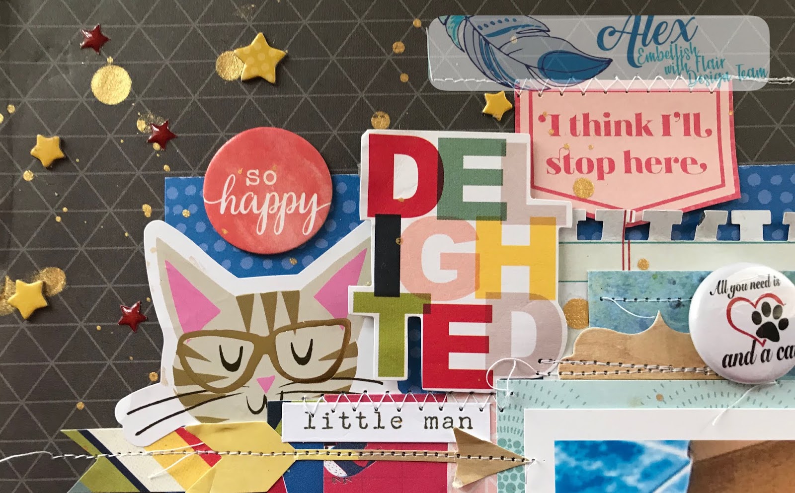
Here are a few close up of them:


 The "love this" sticker is silver but photographed gold for some reason! 😖
 

The main photo was part of the inspiration for my  title along with the fact that this guy is 15 and appreciates more and more of his mothers favourite bands from the '90s!   I do love titles with hidden meanings and my boys are pun crazy so they happen a lot!


The original layout didn't have any journaling and I needed some, so I kept the bottom left corner free and hoped it would fit.  I tried to write small, used ampersands where possible and it fit! Phew!


And lastly, here's the whole thing:

Smells Like Teen Spirit


Embellish With Flair Product Used:

Words 4


Thanks so much for stopping by!  Hope to see you again soon - maybe with a video even!

Love and Embellish With Flair,

--Alex xx


Saturday, August 10, 2019

Cats and Dogs by Alex

Hello lovely Flair Enthusiasts!


Alex here and today's post requires somewhat of a backstory and while it's not part of my "Inspiration Series", it could be looked at as a sort of extension to Part 3 which is about scraplifting.  I think I may have even hinted back then that I had this particular layout in it's beginning stages.  I didn't want it to be the part on scraplifting, since it was a much less true example to the original project.

It turned out to be entirely co-incidental that I'm using both the Cat Flair and much of the same paper (a lot from Shimelle's Box of Crayons which features plenty of cat and dog motifs of which I used 0! 🤷)

Now for the backstory... in May, my buddy Sara Scraps was a guest designer for Virginia Walker in her Facebook group Confessions of a Paper Addict (known as COAPA).  Virginia released a series of animal cut files including a dachshund for Sara.  I got so excited when I saw there was a matching cat so I suggested I should scraplift her layout since I have similar photos with virtually identical expressions!  You can watch Sara's YouTube Process Video here.

Sweet Puppy Days

By Sara Scraps


As I was preparing to do so, I had another idea!  With Sara's permission I used a photo of her dog and my cat and BOTH cut files.  This meant fairly major changes to the original since I had to squeeze in TWO cut files and figure out how much to keep the same and which modifications to make to ensure the layout was in my style.

The first step was figuring out the size and cutting the critters and loosely planning how they will sit on the page.  Painstaking backing of cut files with paper comes next!


Sara's style is quite different to mine and I admire it a lot so I wanted to do it justice, but keep the balance in maintaining the things I love.  Sara used paper cut into strips and punched with border punches.  It was the perfect place to start since my punches don't get as much love as they should!

I used two types of punch as well as some branding strips and narrow strips.  I wanted to make sure I included enough black to co-ordinate with the flair and it could get tricky since I was using a fair bit of navy.

It seems as though I always stitch on my layouts, but I don't I promise!  I just felt these borders and strips were begging for it and I could lift up any loose edges for texture.

The background is an older Studio Calico crosshatch (as opposed to a plain white sheet of cardstock), and while I used multiple photo mats and more borders than Sara had in her original, I split the title into two areas like she did using two fonts as well.  This is definitely different for me (I rarely have the title split like this, nor do I have the construction of the two cut files and photos separated, but it was the only way to squeeze them onto the page).

While I was on the punch kick. I punched some pinked circles under the flair to help them stand out and putting them om either side of the title helps with that and to make it a bit more obvious that it's a single phrase.

Due to the pattern of the pink paper at the top of the page, the embellishment cluster where Sara put hers would have to come down.  And get a whole lot bigger obviously, because this Crafty Mama is all about All.The.Things! 🤣


The corresponding area diagonally across from the embellishment would be the natural spot to put the journaling.  The journaling and story is always critical for me and especially in this case when it may seem a little weird to scrapbook her dog and my cat regardless of our friendship! The story is less about the animals themselves, but more about our similarities and in this particular case only a fellow Fitzwilliam fanatic and Austen aficionado would co-incidentally name her dog the same thing I named my cat! 🙌🙌🙌


Before finishing off with some puffy hearts, I added tiny tabs with the dates of the photos since they weren't taken at the same time.  In such a case as this, I'd most likely store the layout in the same month of the later photo.

A Tale of Two Fitzes


So you can see how I started with Sara's idea, yet made it look really quite different but simply starting with two cut files.  Even without the other changes, it's a pretty big shake up.

Embellish With Flair Products Used:

Cats


Thanks for stopping by and as always, 

Love and Embellish With Flair!

xx Alex

Friday, May 31, 2019

Finding Inspiration Part 3 by Alex

Hello Lovely Flair Enthusiasts!

Alex here with the next installment of my Lost Mojo (or Finding Inspiration) series!  If you missed the first installments, you can find them here:
Part 1
Part 2

So what are we going to discuss today? I honestly didn't expect this to become quite the epic it has, but I'm hoping you're enjoying it (or at least the lovely flair on my layouts 😉)

This is the bit when I think it's worth talking a bit about finding inspiration from OTHER PEOPLE.  I guess you'd say it's like pulling out the big guns if you're really stuck, or perhaps you always do this and there's nothing wrong with that.  There is one golden rule as far as I'm concerned, though and that it to always acknowledge your source or inspiration

There are various ways you can be inspired by other crafters - using a sketch created by someone else, "scraplifting" a finished layout or perhaps taking a class offered by another crafter.  I regularly use all three methods.

Sometimes, my chronic illness doesn't allow me to do the entire process so through trial and error I found that when I need to buy some time or energy, taking this first step out of the equation for me is key to having a finished layout and story told.

Today we'll have a look at scraplifting.  What's "scraplifting" I hear you ask?  While I dislike the term (it implies stealing), it's effectively copying someone else's project.  We're taught that's a big NoNo at school, but that's why people share their work online.  When you find a layout by another scrapbooker that you'd like to reproduce, or get inspiration from, there are endless degrees to which you can do this.

The layout I'm scraplifting is by Shimelle Laine.  Her "style" is pretty close to mine so I often am inspired by her work.  The layout I'm "scraplifting" is a few years old and can be found HERE.  I really recommend you have a look at it first.

Now I could reproduce this layout exactly if I wanted to since I have all the exact same supplies in my stash (I know! 🤦).  I've never done this though!  Not that her layout isn't perfect as it is, but I personally don't want mine to be a cookie cutter replica.  Where's the creativity?  Talking about creativity may seem like a luxury when your mojo is MIA, but I promise, once you get going you will see that your page starts to develop a mind of its own even if it's a pretty close scraplift.

I'd call mine pretty close.  I guess for me it is since I know how far (or not) I end up when I do this.  There are loads of examples on my blog.  If you click on the word "scraplifting" at the bottom of a post on my blog when I use it (like this one), it will bring up more entries.

You might deviate a lot more (and I have a layout in progress where my scraplift took on a mind of it's own which I will post when I revisit this topic later) or a lot less.  Both are absolutely OK!

So where to start?  The easiest way to stay true to the original is to choose a photo which is roughly the same size and orientation.  In this case it appears to be 4x6 in landscape.  Mine is a touch smaller.  The next thing is to pick supplies, but I do find that when scraplifting, the layout does tend to evolve so it's never quite that simple.

My process for this exercise was to first decide on my background paper.  I did toy with navy, but if I was going to use the black and white "Cats" flair badges I'd have to include at least some black which can be a challenge with navy, though not impossible.  I ended up choosing a dark grey which bridged the gap between black and the colour of the grey cat.  I also wanted the focus to be more on the colours of the box. 


If you read Shimelle's blog post and journaling, you'll see that rainbow and colour overall play a key aspect in her story, whereas in mine, the story is about the box in the photo, so emphasizing those specific colours made sense, but I did want to include somewhat of an array of bright colour (especially red of the box (and to a lesser extent blue)). 


Since my photo had far fewer colours than Shimelle's, and that initial pop of rainbow is what makes the dark background so striking, I did want to include some multicoloured paper with black (OK so it could be a very very dark navy in the triangle pattern but reads as black) as well as incorporating all the other colours I planned to use. 

I also ended up having to use more layers because it just didn't look "right" with fewer. 

 
This is what I mean when I say the layout starts taking on a life of its own!  I had to go back and search for various colours and add them in a few times! 

As you can tell, I deliberately curled up loose corners for texture!

I was also thinking embellishment at the same time.  I did want to use that same "delighted" die cut since it's a word frequently used in Regency society and had all the colours I was going to use! 

I wanted to use stitching like Shimelle, although mine was more for decorative purposes (except in a couple of places) rather than holding down notorious chipboard!  I like leaving loose threads if it suits the layout and anything to do with cats suits since they like string and yarn.


I wanted to use some gold also as a nod to the Regency era, so gold mist and gold detail on some of the embellishments worked with the Thickers.  Also...if you're going to stitch, make sure said mist is totally dry or else you'll have to cover up the smudges with the chipboard and enamel stars!! 🤦🤦🤦

I positioned the badges around the photo and picked mostly white ones to stand out.  I did have to use the one with a touch of red to again go back to the original chicken box element of the story!  Also, my son calls him "little man" so that sticker on the top left was perfect in all aspects. 

I'm sure you can figure out the connection between cats and birds/feathers.  It's one of the few times I use bird paper since I have a phobia and aversion to the things and quite frankly the connection freaks me out further, but 🤷.  Shimelle jokes that I'm the only one allowed to disike the birds she has included in her last few collections! 😳😳😳

Most people wont have any idea that all these little decisions relate to the story and my memory of the event, but I love all these little connections and they really make the memory complete in my mind.

Speaking of story...that cat is named Fitzwilliam (after the heartthrob hero), and there is also a character in the novel called Colonel Fitzwilliam!  Not who he was named after, but a good pun in light of the story being about the box!


So can you see how while I have scraplifted a layout, I've also used elements from the Part 1 and Part 2 of this series as well to help make the layout my own and just let the initial inspiration take me where it was going to lead. 

Colonel Fitzwilliam


Well thanks for sticking with me and hope to bring you another way to find that lost mojo very soon!

Embellish With Flair products used: Cats set


Love, and Embellish With Flair!

--Alex xx