Tuesday, July 23, 2019

Scrappin' with Heather

Hi
This week I have done a layout with some very beautiful 49 & Market papers and flowers that I've had in my stash for the right project, and it matches perfectly to these flairs 

I have used a glitter white texture paste and a stencil in the background. Then have layered lots of fussy cut pieces on top, then accented the photo by layering flowers around the bottom of the photo.
I have added the flairs into the flowers to accent the flowers that are on the flairs.


Finding Inspiration Part 6 (final) by Alex

Hello Lovely Flair Enthusiasts!


Alex here with the next installment of my Lost Mojo (or Finding Inspiration) series!  If you missed the first five installments, you can find them here:
Part 1
Part 2
Part 3
Part 4
Part 5

Today I’m bringing you the final installment of the Finding Inspiration or “lost mojo” series.  This one will be about using challenges to find inspiration. 

There are many sites (usually in the form of a blog) which host weekly or monthly challenges.  Sometimes they’re specific like a different colour challenge each week or the type of challenge might vary.

Facebook Groups relating to scrapbooking or cardmaking or more general crafts sometimes have special challenges.  Some commonly found activities include some of the things we’ve already looked at like scraplifting and commonly sketches.  Others frequently found are things Tic TAC Toe (also referred to as bingo) (like noughts and crosses where each box contains a prompt or item to use and you can choose a line in any direction and must include those items), mood boards and many others.

In April, such a Facebook group for the store Anna’s Craft Cupboard were celebrating their 13th anniversary with a cyber crop.  There were plenty of games and challenges and I’m going to go back and complete one that I wanted to do at the time but didn’t get around to it.

There were two "Blind Crops” and for me, your pink, self confessed control freak. these are the most difficult of all!  A blind crop usually is most successful when completed “live” to eliminate the temptation to peek ahead.  The leader has everyone making a layout step by step according to their instructions!  Eg “cut paper B into a 6x8 rectangle and stick to top left of paper A”.  Supplies to have on hand are usually available for some time beforehand, although the level of detail often varies.

The designer of the blind crop I’m going to make is none other than Melinda Sweetman who is probably well known to many of you.

I’m pleased to say I didn’t cheat on terms of peeking at the finished layouts, but I had a tiny cheat which I’ll confess in due process!  The list of supplies was more or less straightforward - except I had 5 papers picked instead of 4.  One was from a paper pad and single sided, so more like 4.5! 🤦🏼‍♀️

Since I rarely pull ink, mist or paint when making up kits, I felt I could justify the “wait and see” approach” when it came to this step.

Not knowing when and how much of each paper would be used was driving me crazy!  After following the cutting and sticking for the pink and woodgrain papers, I pretty much was sure my remaining paper would be the blue/lilac striped one (in the photo cluster) and not the green one.


Once I figured out we were cutting photo mats came my cheat - not only did I use the two specified papers (would have been the woodgrain and the purple) but I decided to also cut a mat from my pink paper and my green floral “spare” paper and do messy offset mats.  I use a lot of paper layers and doing this was like a security blanket! 

At the point when texture paste was required, I went with a "frankenpaste" as I sometimes do.  I mixed Colour Blast in Snow White with Vicki Boutin’s iridescent glitter texture paste (which has a clear base).  I wasn’t super happy when it was drying a bit more translucent than I hoped after 2 steps.  Then I saw paste was required for a third step so I dried off what I had already done enough to put the stencil back exactly as it was.  I mixed a bit of Dreamweaver pearlescent embossing paste into my frankenpaste and after doing the third area I went back over the first two lightly.  This made for some thick paste and in hindsight I should have probably used a denser patterned stencil.

Here are the three pastes swatches separately.  The fine glitter in the Colour Blast is hard to see, but it's gorgeous! 

 
I also wasn’t thrilled with any of my mist choices, but didn’t want the fuss of mixing anything so I knew the shimmer pigment in Heidi Swapp Color Shine should show up even on darker paper.

I had to leave the layout to sit overnight so the thick paste could dry all the way through.  The waiting time and scant adhesive causing the pink and paper to lift a lot at the edges.  I decided to machine stitch for some extra interest.  It's subtle, but adds some texture.

I also had to stitch down the yellow Thickers (not my first choice, but I simply couldn't make the ascending letters of a scripty font work no matter what I tried. 😒

I fussy cut virtually the entire sheet of that gorgeous floral paper from Shimelle's Little by Little collection and eliminated the red flowers and kept the others.  While yellow doesn't appear in the background pattern, it definitely worked as an accent and gave me the option of yellow in the title since both pink and white alphas seemed to blend in too much.  I added the lion die cut from the same collection and some critters from Box of Crayons also by Shimelle hidden among the flowers since the photo was taken at the zoo even though the journaling isn't about the outing itself,

I left the choice of flair until later since I wasn't sure where the blind crop was going to take me.  I opted for the Captured set which was black on white.  The white was going to stand out and co-ordinate with the paste and I wanted to include some camera motifs in the embellishment clusters anyway.

I used the silver, holographic circles from the Thickers phrase set from Shimelle's Sparkle City and some sequins from Spiegelmom Scraps to finish


Embellish with Flair product used:  Captured


I'll see you again soon with something new!

Love, and embellish with flair!

Alex xx


Monday, July 15, 2019

Twinkle Twinkle by Suzanne Franin


Hey Everyone

This project for Embellish With Flair was a fun little project 
Using one of the flairs from the Galaxy, Moon & Stars set 


I used Little Birdie Embossing Texture Paste Aquatini through the stencil then once I heated it so puffed I went over the whole thing with black gesso
After that I used Finnabair's Art Alchemy Sparks Raven Black paint over the background

 Then brushed some Finnabair's Art Alchemy Sparks Unicorns Hair paint over the embossed area and painted the stars with it as well
 I used Finnabair's Art Alchemy Dragons Eye paint over the metal moon 
I used a Tim Holtz sticker onto to add an extra touch
 Inside you can see the clear plastic stars which are from Memory Maze 
I added some clear gems I had in my stash and to pick up on the blue in the flair I added some Art Ingredients Glass Glitter in Platinum
Here you can see all the bits that make it like a shaker box but it's going to get hung up so it all sparkles


From the Store


Thank you for visiting and I hope you come back soon x

Wednesday, July 10, 2019

A Bit Steampunk

Hi all

I had fun trying my hand at steampunk this time using these very cute cog flairs


The papers from Stamperia were a perfect match for these flairs.
The chipboard are pieces I had from partly used packets. They are inked with pine cone ink then finished with a combination of distress crackle and sprays.
I have added accents by using black gesso and an arrow stencil. The final touch was just a little bit of copper leaf.

The photo is of my hubby when we visited the Chu Chi Tunnels in Vietnam last year, he was braver than me and went down into them.

https://www.embellishwithflair.com


Sunday, July 7, 2019

Finding Inspiration Part 5 by Alex

Hello Lovely Flair Enthusiasts!


Alex here with the next installment of my Lost Mojo (or Finding Inspiration) series!  If you missed the first four installments, you can find them here:
Part 1
Part 2
Part 3
Part 4

As we continue our journey through the last few examples of getting inspiration from other artists' work,  we have just two more ways to look at.  Well, there are probably a lot more than that, but we have to stop at some point, right? 😂

Today we’re looking at a SKETCH.  A sketch is a (very) much simplified page design with symbols as a guide rather than a completed scrapbook layout to scraplift.  Sort of like the blueprints of a house rather than photographs of a fully furnished and decorated home!

Sketches come in varying levels of detail and there is something for every crafter.  You just need to figure out the level of detail you're after.

Search the same places for “scrapbook sketch” as we looked at in Part 2 of this series and see what comes up.  You can be more specific by adding number of photos etc into the search bar.

Today I’m going a little bit outside of my comfort zone and using a slightly different kind of sketch (for me), but it still has places to put lots of details and layers if so desired.

With this sketch, (like any sketch) you can follow faithfully or change it around. 

The sketch I’m using comes from Cocoa Vanilla Studios and it was used as a challenge for (inter)National Scrapbook Day.  Since I didn’t get around to using it by the challenge deadline I’ll use it today.


Their Face Book page has an album with all the sketch entries on to and I love seeing everyone’s different takes on the sketch.

I’m not sure how it came about, but I decided I was going to do a gaming layout, and I have a seemingly bottomless pile of those photos to scrapbook!  🙈  It was simply what was talking to me at the time! 🤷

I also started looking through paper that might work with the story and ended up in my Cocoa Vanilla section.  Subconscious decision being their sketch perhaps?  🤷  They do incredible boy collections and "Boys Rule" is probably my favourite very closely followed by "You Rock".  I mostly used these lines along with a few bits of the "Imagine That" boy line by Echo Park, a few Bella Blvd papers with gaming motifs and a few other random bits.


What does immediately strike me with the sketch is that there isn’t a designated spot for journaling and since this is critical for me, I need to figure this out before getting carried away with embellishing.


At this point you can decide how literally to take the sketch - to use exactly as many layers as the sketch or more or less?  To use the same number of embellishments (and maybe even the exact same motifs) or more or less?  I went with my typical multiple layers, multiple embellies and instead of girly motifs like butterflies and flowers, you can see how I was able to make this sketch work as a very boyish layout.

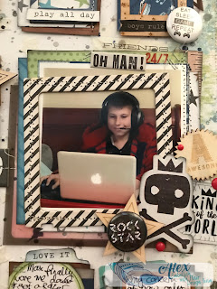
I’m going to be a little predictable and keep the photo on the designated photo spot (it looks best here since he is facing a little towards the left), so I can have fun with as many little embellishment boxes as possible!  You could also substitute some of the smaller squares for extra photos if you wanted to.

You could change the position of the boxes, mirror image the sketch, turn it upside down or change it to suit a different size page (eg 9x12 or 8.5 x 11).

The photo is this single, oddball, not-very-great-photo, but I never shy away from using these sorts of photos if they tell a story.  Using a sketch like this one I think slightly distracts from the imperfections of the photo, but I need to take care not to get it lost completely!  I printed the photo in both black and white and in colour.  Initially I preferred the b/w, but i definitely wanted to include red (which was in "You Rock", but not "Boys Rule" and a darker woodgrain since his bed takes up a fair amount of the image and it's a lovely warm brown timber sleigh bed.  "Boys Rule" had a great woodgrain paper which I used as a frame.  In the end I went with the coloured version.

I constructed all the little squares and the larger photo square separately before sticking them to the page (with the exception of a few finishing touches).  They're a great size for housing flair!  Metal flair badges have a great boyish vibe and give me the dimension and texture I crave on a layout.  More texture was added with machine stitching (yes, you can totally stitch right through the thickest chipboard frames and acetate and layers of paper...together even!).  You can also staple right through wood veneer elements! 👍


I do struggle to use the various sized frames that come in embellishment packs or on their own.  I was determined to use as many as I could on this layout since the sketch really lent itself to them.  I pulled out frames in all kinds of finishes from acetate to chipboard to vellum.  I also seem to struggle with acetate embellishments especially those photo overlays by Crate Paper from at least five years ago.  I was determined to work some of those into my layers!


After trimming and adhering the white paper with the faux messy paint around the edge,  I decided I wanted to add some paste through a star stencil.  This necessitated masking off the woodgrain border (since the paste ended up being a bit of an afterthought).  I mixed white and pearlescent embossing pastes together as the pearl ones sometimes dry kinda silvery, but oddly my "franken-paste" dried kinda yellowish!  🤷 I also went to town with ink droplets in co-coordinating colours.  Most would end up covered and toned down.

I opted for embossing paste over modelling paste or texture paste since its the softest and knowing I was going to sew through it, it needed to have a bit of "give".  There was also the added benefit of popping up all my elements a little off the paper. 👍

The down side is that if you're going to adhere anything to mixed media paste, you need a REALLY strong adhesive.  There are a few options, but my personal favourite is Glue Dots.  There are all sorts of Glue Dots for all kinds of purposes.  Permanent squares or dots (in the blue dispenser) are ideal to stick the finished squares to the background and also for adding embellishments on top of them like the flair, chipboard and wood veneer stars etc


Once I had the bones of my layout figured out, I put the sketch aside since there wasn't anything else I needed from it.  You may wish to do this sooner in your process if it diistracts or confuses you, or keep it in front of you right to the end.  There isn't a correct approach!

Three of the badges came from the "Gamer" set and I searched high and low for "Words 4" in my stash only to discover I don't have it yet (I think it's on its' way to me as we speak!) so I used one from "I Wanna Rock" to have 2 white and 2 black.

Gamer


After sticking the layered embellishment clusters and photo cluster to the background,  I came in with the bulky embellishments and then smaller stickers, words stickers and finally a few enamel dots.  The embellishment clusters were so much fun to put together, but they did take a little while to do.


Overall, I'd say I stuck to the sketch reasonably faithfully while still keeping the elements in my pages that make them mine.  I tend to stick to sketches fairly closely when I do use them.  To me it's the whole point of using them, but as I outlined above, there are plenty of other approaches.  Sometimes the way my photo is composed means I mirror image the sketch or rotate it in some other direction to suit the composition better.  

Here's the finished layout!

One Sided Conversation


Do let me know if you have any questions in the comments or want to talk about how you like using sketches!

Embellish With Flair products used:


Love, and Embellish with Flair,

Alex xx